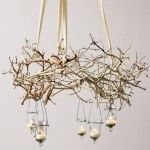
The interior in the style of Pop-Art and its features
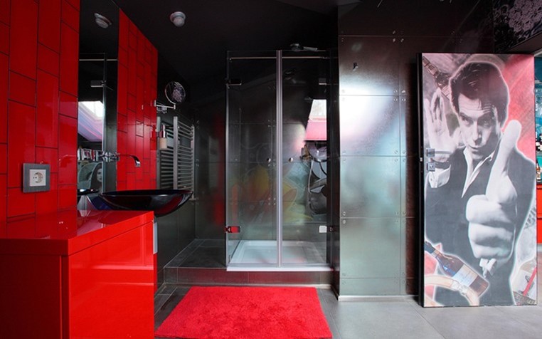
A distinctive feature of Pop Art is saturated contrasting colors, simple shapes and bright graphics. Such a way of expression came to taste all those who had a bold, dynamic and expressive character. As a result, Pop-Art has gained incredible popularity, and now it remains one of the most fashionable areas.
Guidelines and Rules
At first glance it may seem that bright colors in the interior is quite enough to create Pop-Art. However, in order to make the design according to the style will require some effort and follow the basic rules
Color
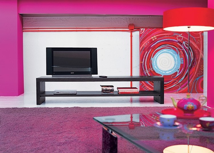
Despite the fact that the Pop-Art manifests itself through contrasting color combinations, in the design of the room is better to use only 2-3 main colors.
Architecture
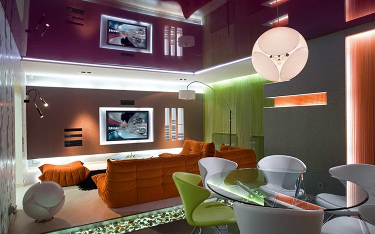
Widely applied multilevel ceilings, wall niches and zoning space.
Light
The abundance of light gives the amount of space that is exactly what we need. Therefore, welcomed the large number of lamps and special lighting with an unusual shape.
Eccentric forms
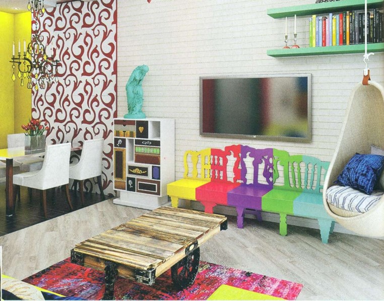
Furniture and decorative elements must have an unusual shape. For example, can be used futuristic chair in the form of lips or table as an inverse cone.
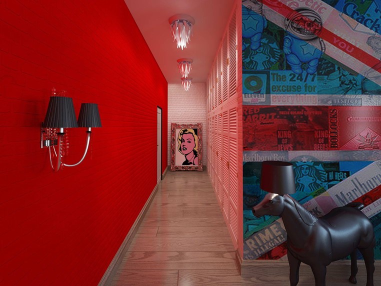
Daring decoration items
Feel free to use collages, posters, paintings and portraits of idols. You can print or draw images and most importantly – make it to look outside the box. Don’t forget to have fun.
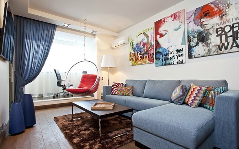
Tech materials
Modern materials (plastic, metal, glass), with a rich color palette and texture, will be an excellent assistant designer.
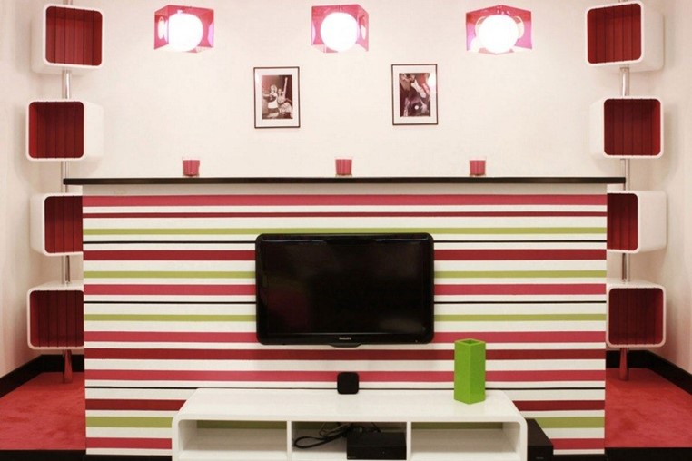
Bright prints
Bright prints can be in everything: wallpaper, textiles, walls and furniture. Look great animalic motives, chaotic patterns and phonograph records on the wall.
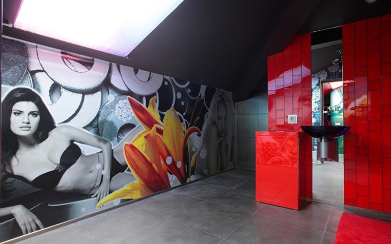
The interior in the style of Pop-Art is most suitable for creative, rhythmic and creative types. It is synonymous with the eternal holiday.
